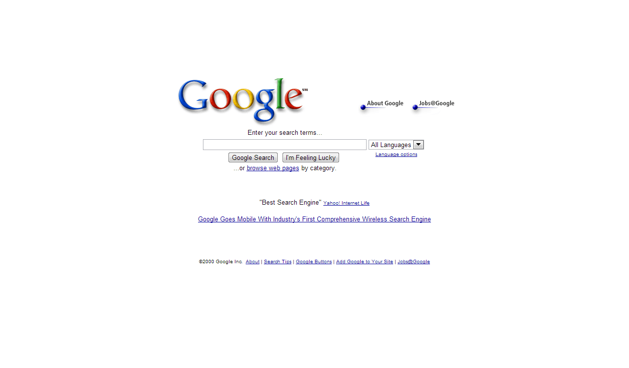
Since its popularization in the middle of the 90's - mainly thanks to Windows 95 which brought neophytes to the use of computers - the face of Internet has changed many times. The trend even seems to be quickering: back in 2000 most websites were changing their design after two years of use in average, it is now usual that design modifications are integrated every year or even more. Out of this we could make a parallel with clothes fashion.
At first was the information
In the late 90's most websites were actually an aggregate of links with no special effects on them. Focus was made on the quantity of information available regardless of the look of the general site. The only noticable design efforts were for company logos. On the other side this presentation was giving the emphasis on the information itself with limited extra-attractions (and limited advertisement too). This conclusion changed dramatically in 2-3 years. Most websites decided to include designed elements in their look and especially some shadow effects - which thankfully got removed quickly.
"Flat is trendy"
Step by step the main websites tried to organize their information by some simple color codes. They used background-colors to easily make some information noticable (eg. the sponsored websites on Google) and used less and less shadow effects. However there was still too much information to be easily readable. Most websites slowly decided to target the most relevant pieces of information for their users and organized the other parts in subpages.
Some shadow effects remained active on the buttons or the borders of elements for instance. The pace has now increased: we have recently seen a new progress towards a "Google-style" design - clean, mostly white, with plain colored backgrounds.
Yes, we said the word, Windows 8! The new version of Microsoft's main software introduce a structural visual change. Not because of the new "desktop" made of tiles, not because of the deletion of the start button but with another deletion: the window shadows have been removed. Images are better than words, I let you judge the result by yourselves:
Skype, recently bought by Microsoft, also changed its interface to fit with Windows 8:
To conclude
Another example would also be Outlook.com, the new version of hotmail.com. Of course most of these websites are from Microsoft however the giant of Seattle walks in the footsteps of Google. These two societies together are large enough to imply on thousands, if not millions, of other websites. They are milestones in web design as brands such as Dior or Chanel are in clothes fashion.
Not convinced yet? Have a look at the new video reader from Youtube, or even the new interface of the popular mashable.org
Bonus: discover how websites evolved with the Wayback machine


